As a millennial, I'm used to finding out everything online and the contact details of someone I've previously met is no exception. A quick search of Google or LinkedIn would normally provide me with a fast way to message most people in my industry. So you'd be forgiven for thinking that I'm probably not interested in business cards. Actually, this is not true - I think that they can be really great! As part of my series of blog articles describing my introduction to the printing industry, I found some really fantastic examples of business cards that would draw me in and make me want to keep hold of them. So I thought I'd share them for anyone who is trying to attract a millennial audience and needs a bit of inspiration.
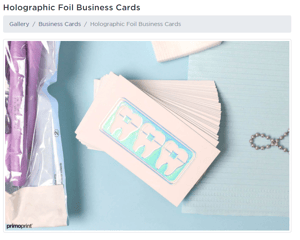 These business card have been created by Primoprint and I love them! If I received one of these, I can guarantee I would be interested because of how creative they are, how different they are from a 'traditional' business card. The holographic effect goes nicely with the white background as there's nothing to distract from it. The extra detail of having the holographic portion raised slightly also gives it that extra flare.
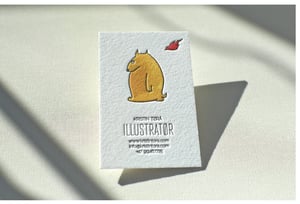
Elegante Press definitely made these business cards stand out for their client, Norwegian illustrator, Kristin Tørå Rantanen. To start with, the cards were printed on cotton paper rather than traditional card stock, meaning even from touching this card you would know there was something more interesting about it. Along with this, they used letterpress which adds to the interesting texture of the product and they included no colour, purposefully. The intention was that the cards could be left blank, or could be hand painted by the client herself if she wanted to do so (check out the website to see some of the other design that she created). This meant that the cards could be given a personalized feel (and in this day and age, everybody wants personalized - especially the younger generation!) allowing each one to have a different feel.
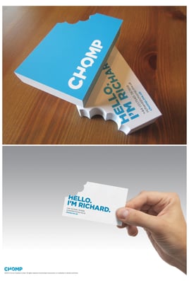
I personally love how this company used a different shape to the usual rectangle, it really makes it stand out and I’d definitely take notice of this. This business card was made by Chomp when they wanted to create a literal interpretation of their name within their cards. They chose to have a corner of their business card removed in the shape of a bite mark, to mimic this having been 'chomped' off. Don't you think this idea is great? The simplicity of the rest of the card makes the 'bitten' part stand out even more as it's what the eye is directly drawn to, leaving the rest of the card to be read afterwards. In general, I think younger audiences are more accepting of non-traditional designs and are more likely to be attracted by something new and exciting.
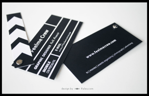 When business cards don't portray much about the company apart from who they are and how to contact them, there's nothing about them that really grabs my attention. But when they express some brand personality, or hint at what the business does without having to read the card, it's more likely to spark my interest! Ralev Logo and Brand Design created a unique business card for Feelme Crew who mainly work with video filming and editing. To help make them stand out in a competitive industry, they created a business card with lots of personality. They played with designs and managed to create this amazing one which also has the ability to move on the top section like a real clapperboard. This is sure to turn some heads!
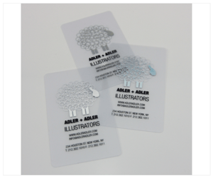
Something different from all the rest of these is a business card offered by Formink. One of their designs is a translucent plastic business card and they created some for Adler and Adler illustrations. Using a different material, in my opinion, is super interesting and is a great way of attracting the attention of younger audiences! The text has been kept plain and the images are in metallic silver which looks great against the transparent background. They are also rounded on the edges which again, is not traditional but looks great, giving them another reason to stand out above the rest.
If there are any other business cards that you find interesting, or you think would attract people's attention due to their originality and design, let me know!